5. Uncertainty Visualization
Be able to visualize uncertainty is often neglected but it is a challenging topic. Depending on the number of input parameters and the dimension of the quantitie of interest, there are several options implemented in the package.
| Function or class | Dimensionality | Description | |
| Input | Output | |||
doe() |
n-scalar | scalar, vector | Design of Experiment |
response_surface() |
<5 scalar | scalar, vector | Response surface (fig or movies) |
HdrBoxplot |
vector | vector | Median realization with PCA |
Kiviat3D |
>5 scalar | scalar, vector | 3D version of the radar/spider plot |
Tree |
2D scalar | scalar, vector | 2D version (kind) of the Kiviat plot |
pdf() |
scalar, vector | Output PDF | |
corr_cov() |
scalar | vector | Correlation of the inputs and outputs |
sobol() |
scalar | scalar, vector | Sensitivity indices |
All options return a figure object that can be reuse using reshow().
This enables some modification of the graph. In most cases, the first parameter data is
of shape (n_samples, n_features).
5.1. Response surface
5.1.1. What is it?
A response surface can be created to visualize the surrogate model as a function of two input parameters, the surface itself being colored by the value of the function. The response surface is automatically plotted when requesting uncertainty quantification if the number of input parameters is less than 5. For a larger number of input parameters, a Kiviat-3D graph is plotted instead (see Kiviat 3D section).
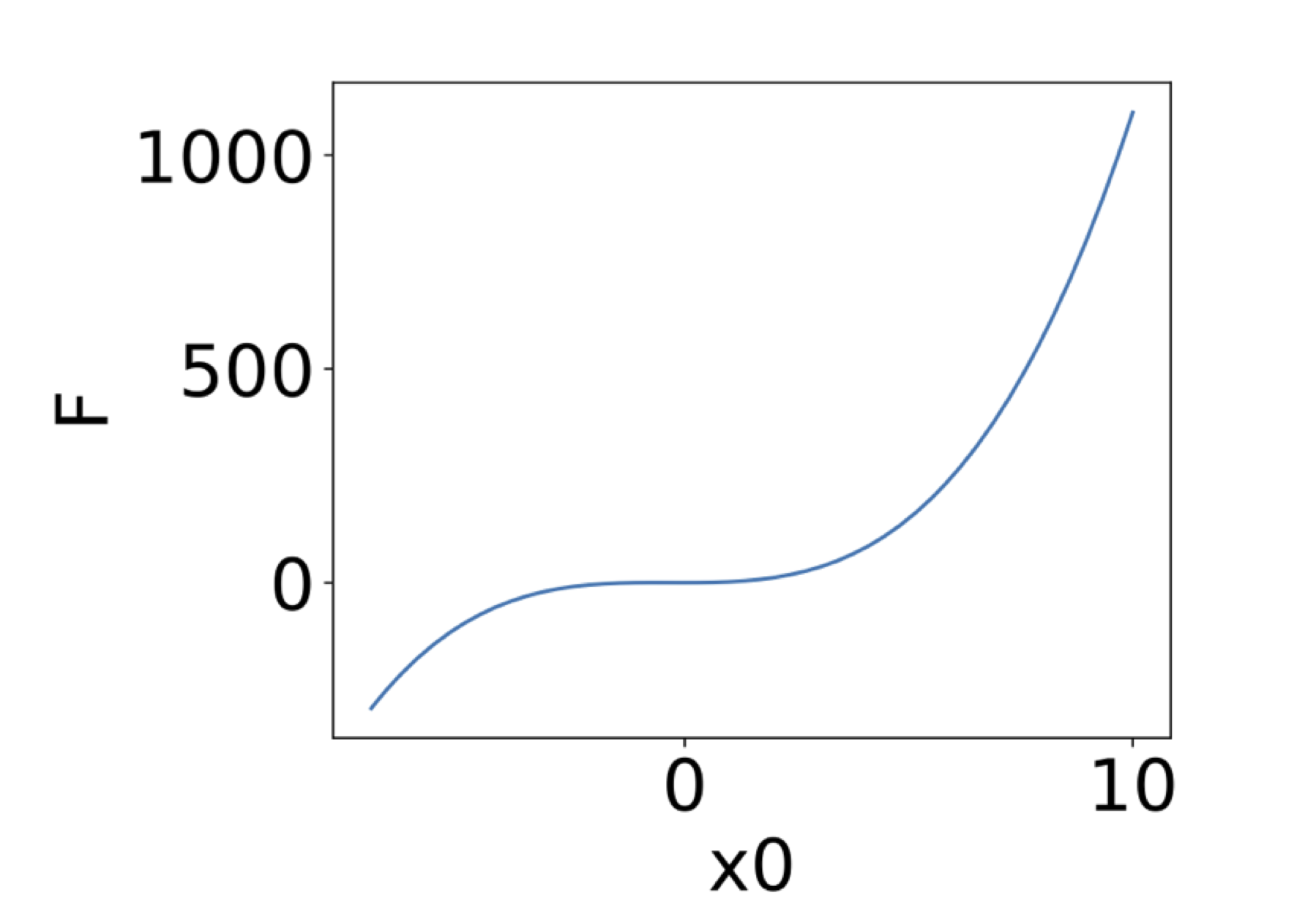
If only 1 input parameter is involved, the response surface reduces to a response function. The default display is the following:
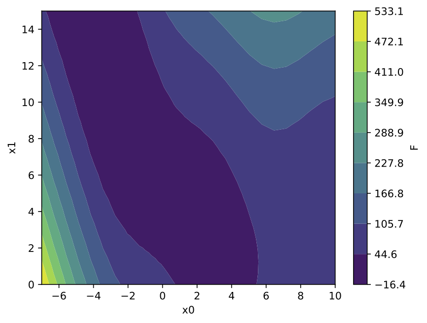
If exactly 2 input parameters are involved, it is possible to generate the response surface, the surface itself being colored by the value of the function. The corresponding values of the 2 input parameters are displayed on the x and y axis, with the following default display:
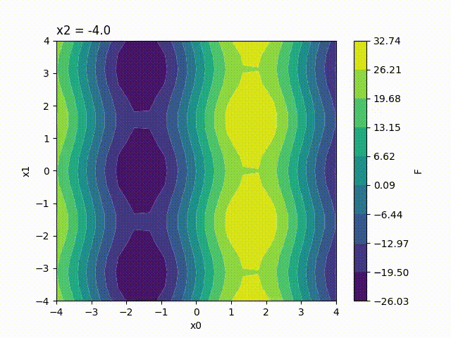
Because the response surface is a 2D picture, a set of response surfaces is generated when dealing with 3 input parameters. The value of the 3rd input parameter is fixed to a different value on each plot. The obtained set of pictures is concatenated to one single movie file in mp4 format:
Finally, response surfaces can also be plotted for 4 input parameters. A set of several movies is created, the value of the 4th parameter being fixed to a different value on each movie.
5.1.2. Options
Several display options can be set by the user to modify the created response surface. All the available options are listed in the following table:
| Option name | Dimensionality
|
Default
|
Description
|
|---|---|---|---|
| bounds | Array-like.
|
None
|
Specify new bounds for the response
surface. Space corners are used if no-
thing is specified. Values should have
the same dimension as space corners and
the new domain should be included
inside the space corners.
|
| doe | Array-like.
|
None
|
Display the Design of Experiment on
graph, represented by black dots.
|
| resampling | Integer.
|
None
|
Display the n last DoE points in red
to easily identify the resampling.
|
| xdata | List of
real numbers.
Size = length
of the output
vector.
|
If output is a
scalar: None
If output is a
vector: regular
discretisation
between 0 and 1
|
Only used if the output is a vector.
Specify the discretisation of the
output vector for 1D response function
and for integration of the output
before plotting 2D response function.
|
| axis_disc | List of
integers.
One
value per
parameter.
|
50 in 1D
25,25 in 2D
20,20,20 in 3D
15,15,15,15 in 4D
|
Discretisation of the response surface
on each axis. Values of the 1st and 2nd
parameters influence the resolution,
values for the 3rd and 4th parameters
influence the number of frame per movie
and the movie number respectively.
|
| flabel | String.
|
‘F’
|
Name of the output function.
|
| plabels | List of
string.
One chain per
parameter.
|
‘x0’ for 1st dim
‘x1’ for 2nd dim
‘x2’ for 3rd dim
‘x3’ for 4th dim
|
Name of the input parameters to be
on each axis.
|
| feat_order | List of
integers.
One value per
parameter.
|
1 in 1D
1,2 in 2D
1,2,3 in 3D
1,2,3,4 in 4D
|
Axis on which each parameter should be
plotted. The parameter in 1st position
is plotted on the x-axis and so on…
All integer values from 1 to the total
dimension number should be specified.
|
| ticks_nbr | Integer.
|
10
|
Number of ticks in the colorbar.
|
| range_cbar | List of
real numbers.
Two values.
|
Minimal and
maximal values in
output data
|
Minimal and maximal values in the
colorbar. Output values that are out
of this scope are plotted in white.
|
| contours | List of
real numbers.
|
None
|
Values of the iso-contours to plot.
|
| fname | String.
|
‘Response_surface
.pdf’
|
Name of the response surface file(s).
Can be followed by an additional int.
|
5.1.3. Example
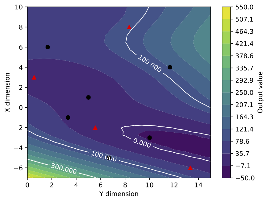
As an example, the previous response surface for 2 input parameters is now plotted with its design of experiment, 4 of the points being indicated as a later resampling (4 red triangles amongs the black dots). Additional iso-contours are added to the graph and the axis corresponding the each input parameters are interverted. Note also the new minimal and maximal values in the colorbar and the increased color number. Finally, the names of the input parameters and of the cost function are also modified for more explicit ones.
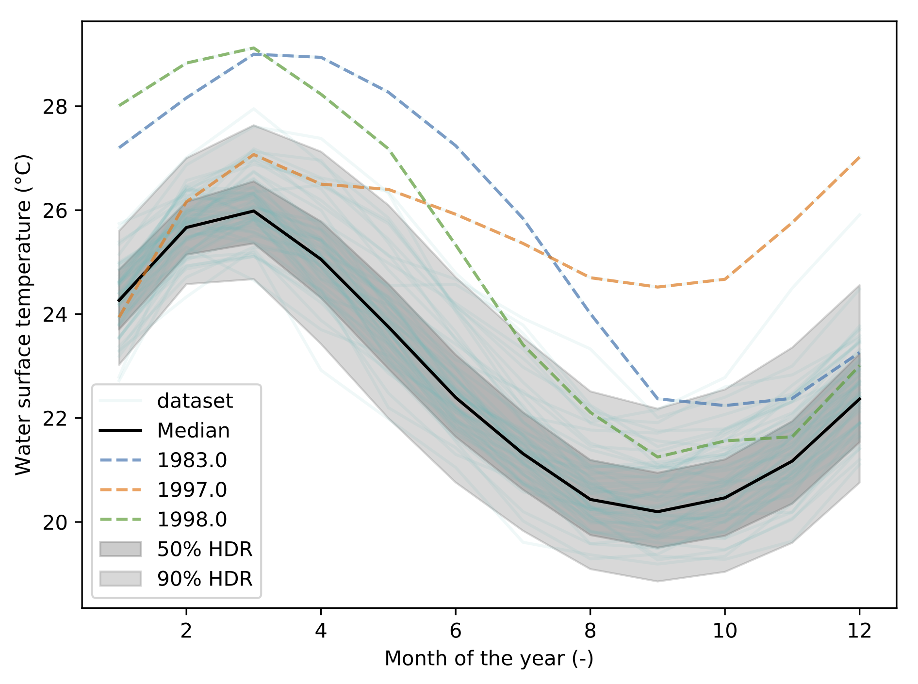
5.2. HDR-Boxplot
5.2.1. What is it?
This implements an extension of the highest density region boxplot technique [Hyndman2009]. When you have functional data, which is to say: a curve, you will want to answer some questions such as:
- What is the median curve?
- Can I draw a confidence interval?
- Or, is there any outliers?
This module allows you to do exactly this:
import batman as bat
data = np.loadtxt('data/elnino.dat')
print('Data shape: ', data.shape)

hdr = bat.visualization.HdrBoxplot(data)
hdr.plot()
The output is the following figure:
5.2.2. How does it work?
Behind the scene, the dataset is represented as a matrix. Each line corresponding to a 1D curve. This matrix is then decomposed using Principal Components Analysis (PCA). This allows to represent the data using a finit number of modes, or components. This compression process allows to turn the functional representation into a scalar representation of the matrix. In other words, you can visualize each curve from its components. With 2 components, this is called a bivariate plot:
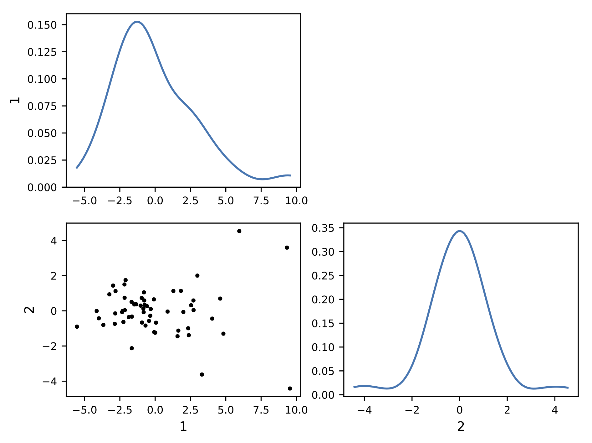
This visualization exhibit a cluster of points. It indicate that a lot of curve lead to common components. The center of the cluster is the mediane curve. An the more you get away from the cluster, the more the curve is unlikely to be similar to the other curves.
Using a kernel smoothing technique (see PDF), the probability density function (PDF) of the multivariate space can be recover. From this PDF, it is possible to compute the density probability linked to the cluster and plot its contours.
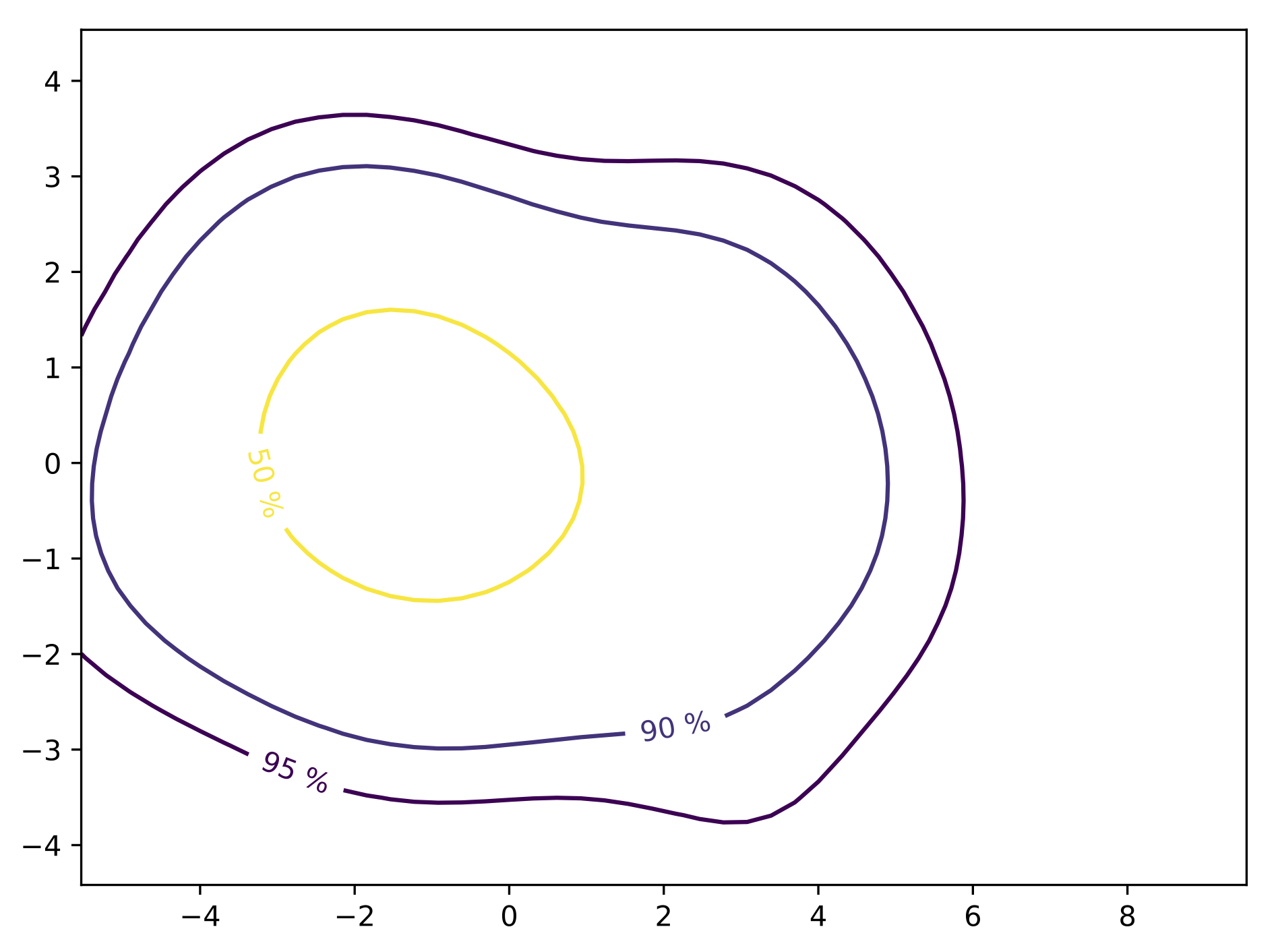
Finally, using these contours, the different quantiles are extracted allong with the mediane curve and the outliers.
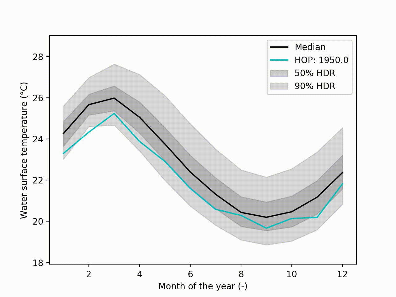
5.2.3. Uncertainty visualization
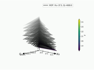
Appart from these plots. It implements a technique called Hypothetical Outcome plots (HOPs) [Hullman2015] and extend this concept to functional data. Using the HDR Boxplot, each single realisation is superposed. All these frames are then assembled into a movie. The net benefit is to be able to observe the spatial/temporal correlations. Indeed, having the median curve and some intervals does not indicate how each realisation are drawn, if there are particular patterns. This animated representation helps such analysis:
hdr.f_hops()
Another possibility is to visualize the outcomes with sounds. Each curve is mapped to a series of tones to create a song. Combined to the previous f-HOPs this opens a new way of looking at data:
hdr.sound()
Note
The hdr.sound() output is an audio wav file. A combined video
can be obtain with ffmpeg:
ffmpeg -i f-HOPs.mp4 -i song-fHOPs.wav mux_f-HOPs.mp4
The gif is obtain using:
ffmpeg -i f-HOPs.mp4 -pix_fmt rgb8 -r 1 data/f-HOPs.gif
5.3. Kiviat 3D
The HDR technique is usefull for visualizing functional output but it does not give any information on the input parameter used. Radar plot or Kiviat plot can be used for this purpose. A single realisation can be seen as a 2D kiviat plot which different axes each represent a given parameter. The surface itself being colored by the value of the function.
To be able to get a whole set of sample, a 3D version of the Kiviat plot is used [Hackstadt1994]. Thus, each sample corresponds to a 2D Kiviat plot:
import batman as bat
kiviat = bat.visualization.Kiviat3D(space, feval, bounds)
kiviat.plot()
Note that only the DOE points are plotted in the Kiviat plot in order to limit the number of surfaces to visualize. Surrogate model is thus never used to predict the value of the function.
Several visualization options used for the response surfaces generation can be used to create the Kiviat plot. Options working with Kiviat plot are flabel, plabels, ticks_nbr and range_cbar. All other options are not read and does not impact the output graph.
When dealing with functional output, the color of the surface does not gives all the information on a sample as it can only display a single information: the median value in this case. Hence, the proposed approach is to combine a functional-HOPs-Kiviat with sound:
batman.visualization.kiviat.f_hops(fname=os.path.join(tmp, 'kiviat.mp4'))
hdr = batman.visualization.HdrBoxplot(feval)
hdr.sound()
5.4. Tree
In case of a 2-dimension parameter space, Kiviat plot can be improved by considering segment instead of plane. Thus, the sampling is still represented as a vertical stack and this leaves the ability to encode another information in the remaining dimension. With a functional dataset, difference from the median computed by HDR is encoded as an azimutal component. The more the segment is tilted, the more the sample is different from the median:
import batman as bat
tree = bat.visualization.Tree(space, feval)
tree.plot()
5.5. Probability Density Function
A multivariate kernel density estimation [Wand1995] technique is used to find the probability density function (PDF)  of the multivariate space. This density estimator is given by

With  the bandwidth for the i th component and
  the kernel which is chosen as a modal probability density function that is symmetric about zero. Also,
  is the Gaussian kernel and are optimized on the data.
So taking a case with a functionnal output [Roy2017], we can recover its PDF with:
fig_pdf = bat.visualization.pdf(data)
5.6. Correlation matrix
The correlation and covariance matrices are also availlable:
bat.visualization.corr_cov(data, sample, func.x, plabels=['Ks', 'Q'])
5.7. Sobol’
Once Sobol’ indices are computed , it is easy to plot them with:
indices = [s_first, s_total]
bat.visualization.sobol(indices, p_lst=['Tu', r'$\alpha$'])
In case of functionnal data [Roy2017b], both aggregated and map indices can be passed to the function and both plot are made:
indices = [s_first, s_total, s_first_full, s_total_full]
bat.visualization.sobol(indices, p_lst=['Tu', r'$\alpha$'], xdata=x)
5.8. Acknowledgement
We are gratefull to the help and support on OpenTURNS Michaël Baudin has provided.